
Gary G
3734

Thank you so much for this splendid reply (photo examples included)
I really appreciate your thoughtful comments. As a fellow DS owner, I know where you are coming from! The only thing about the DS for me is that the winding is almost too smooth -- the Dato, for instance, gives a bit more of a click-click-click, which is something I like. Certainly can't complain at all about either the DS or the Dato -- and the PLM is another splendid morning activity, although one that I've only encountered as part of a loan from a good friend.
While it's not a manual wind watch, the Antiqua also of course has a seductive feel to the winder -- I'm a bit cautious about over-using that, however, as I'm sure it's not meant for heavy use. Steampunk forever!
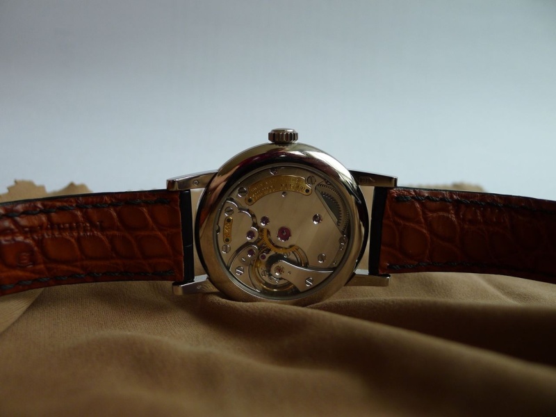
On to your question about the photographs. I do post-process my photographs, but I hope not to excess. In this case (and to be honest, in most cases) I intentionally choose exposures in which the lighting gives a high-contrast view of the movement. To illustrate, here's the "glow" shot from my original post:

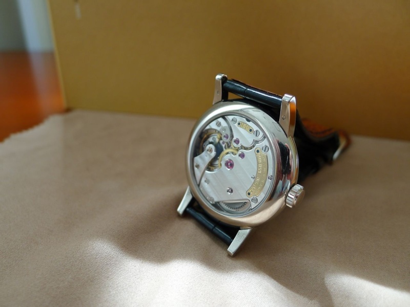
Next, the source photo for this image, uncropped and unprocessed exactly as it came out of the camera:

If you zoom in on the portion of the latter photo that I used in the former photo, you'll see that they are quite similar. After the crop, I did boost the contrast of the cropped image, but not by a huge amount. You'll also see that I selected the left hand portion of the movement for the crop, as the right side is blown out a bit by the light from the window.
The image above was number 40259 as labeled by my camera. Two exposures later with slightly different positioning and masking, look how different image 40261 is:
You can barely make out the striping! This is what I mean when I say that the striping on the Simplicity is something unto itself -- from some angles and in some lights it is very prominent, while as a general rule the effect is almost flat.
From the next day's shooting, let's look at number 40310:
...and then two shots later, 40312:

Same camera, same watch, same location a few seconds apart -- but different contrast lighting conditions. As above, both of these shots exactly as taken with no cropping or processing.
Finally, a crop from that last image, selected from a particularly high-contrast portion of the shot:

Again, I probably boosted the contrast on this one a bit,but not a lot compared to the source image.
Hope that "sheds some light!" I do occasionally fall into over-processing of my photos, so point taken, but in this case I hope that the inclusion of the "out of the box" unprocessed images gives an impression of how I bias my selections toward sharpness and high contrast.
Thanks again for your comments!
Best,
Gary G
Simplicity wearing impressions (with new photos)
Well done Gary!
Thanks, Weekeat!
Gary, my favorite summary I have read of the Simplicity
Very pleased you enjoyed it!
An entertaining read Gary!
Don't strain your eyes too much!
All worth it Gary all worth it!
Lucky wrist


What a fantastic post Gary!
Thanks very much, Fernando

you own a pieceof watchmaking history. Thanks for the open view with not only likes
When the perfect watch is made
Wow, I really enjoyed that review, Gary!
It surprised me as well

a really, really great review!
Thank you so much for this splendid reply (photo examples included)

Cotes de Geneve
Thanks for the additional comments

Thanks, Don -- be on the lookout for my next post...

fantastic post
Means a lot to me coming from you, John

That was some comprehensive post. I often wonder...
It's an interesting question, Ronald

Where do you get the time to do these reports?
Extensive business travel away from home helps, I suppose!

Tremendous and thoroughly well written post Gary, thanks for taking the time!
As you have said yourself, Tim...

Fantastic writing, Gary!
As always, Ken, you are very kind
I really enjoy reading your reviews...
My pleasure, Dave

Thanks, Arthur!
Definitely Gary!

Sensing true love with this post...
Great to hear from you, Echi
Hahaha!
Highly entertaining and informative observations...
My pleasure, 'bear

What mor to add?
Would love to hear your points of disagreement!

Spec of dust or dot?
End of the Roman Numeral V
Thanks, Ling

I don't like it
I don't like it either,Gary!

You are doing a Britney Spear..."ops I did it again" plus becoming a "judge" !! :)-
I need one of these too lol
Enjoy your Observatoire for now!

Interesting thoughts on a beautiful piece
Thanks, SJX!
One additional photo
5078

You are obviously in love with this my friend!
Attention to detail!

Gary, thank you for such a marvellous read.......
Glad you enjoyed it, Tony
Stephen, you hijacked the thread! Kidding...
Actually rants like yours shows how pitiful i am

(sigh)
An interesting dialogue
keep'm coming!
Dear S...
non-watch related observation......
Sorry for being this late
Thanks for weighing in, Thomas!

Great post...
Thank you, Hans
Thanks to all ...
Thanks for checking in!

Well, Gary, your post has just placed the Simplicity...