
Gary G
3734

Simplicity wearing impressions (with new photos)
Greetings to all!
It has been over three weeks now of wearing the Simplicity, so it's probably time to offer a few initial impressions of the experience. As always, all opinions are mine alone, and are presented in my usual love/not sure/don't love format. And, of course, all comments, questions, and criticisms are welcome! One technical note: all photos were taken with either my Leica P&S or my iPhone, so not of DSLR crispness -- but I tried to select the best shots to represent individual points rather than compiling a "beauty book" on the watch overall (lots more time for that later when I'm back home with the light tent...). There are a huge number of truly extraorinary Simplicity photos out there from SteveG, SJX, Peter Chong, Harry Tan, and others -- I'm not even in the competition, so please take these images for what they are...
One of the things that I've grappled with is getting past the tendency to say "oh my gosh, I'm wearing a Simplicity!" every time I look down. This piece and its maker are so legendary that I think it's all to easy to lose the actual timepiece in its aura. It's a legend, but is it a great watch? (spoiler alert: it's a great watch). Perhaps more to the point for me: is it love (my wife), desire (Halle Berry), or deep admiration (Mother Teresa)? (Disclaimer: if anyone asks, I also desire and deeply admire my wife  ).
).
Let's get underway with what I love about this watch:
1. One word: Coherence. When Alex was kind enough to host a conversation among VC enthusiasts several months ago, he asked a very provocative question: what is the most important element of watch design? My argument was (and is) that coherence -- an internal integrity and consistency -- is critical. Dufour sometimes talks about his dislike for "complication cocktails" -- watches that have odd-seeming complications tacked on just to make them more complex. I believe that Philippe thinks a fair amount about ensuring that all of the parts of his creations fit together into a coherent whole -- and I, at least, believe that he succeeds.
I'll have more on this as I go along, but just take a look:


On both the front and reverse of the piece (and in systems that appear from both sides, like the winding train) there is a real consistency and seemingly purposeful matching of styles. I for one can't find a single element of the design or construction that seems jarringly out of line with all of the others -- and I've looked pretty hard!
2. The hands. The shape is great, including the off-center circles and refined tips. Length and proportion lovely, and delicate without being fussy. The seconds hand isn't just a copy of the other hands, which I find an interesting feature (on the theme of coherence, to me the seconds hand matches the Arabics on the subdial just as the main hands match the Romans on the main dial).
The color of the hands is fabulous as well (if difficult to catch in a photograph). And that small black-polished ring in the center that secures the delicate hands in place (although it bugs a good friend of mine who prefers all blue) is both functional and also catches the eye with a glint from time to time, reminding us of the great finishing throughout the watch. Even the end of the minute hand shaft is perfectly polished and beveled.

3. Lots to like about the dial. To be honest, had I had the opportunity to order a watch to be made, I probably would have gone with the silver dial with the "wavy gravy" guilloche. That said, I have really come to appreciate this dial for a number of reasons. It's very clean and balanced; the lacquer finish, which perhaps lacking the luminosity of enamel, is extraordinarily clean and (for me) makes the appearance just that little bit less dressy -- allowing it to be worn on an everyday basis, not just on special dress occasions. I like the use of both Romans and Arabics, and find the fonts pleasing to the eye (no offense to anyone, but that font on the seconds subdials of some modern Pateks just seems jarring to me, for instance). There's that name -- in a font that is for me entirely in keeping with the rest of the dial and reflective of the "old school" philosophy of the man himself. The railroad tracks give a nice sense of precision, and there's a nice symmetry between the tracks on the main dial and subdial.

4. Speaking of the subdial, let's take a closer look:

Ridges! Not that easily visible to the naked eye, but there nonetheless -- and in certain lights provides a bit of visual contrast to the dial. In the photos above you can also see that on the 37mm watch part of the "VI" is visible below the subdial, and to the right of the image immediately above we can see just a bit of the serif of the "V." I particularly like the latter; it would have been easy to say "well, no one is going to notice if the serif is missing, and some folks might think it's a flaw when they look at the watch." Neat to see that they have maintained the integrity of the font.
There's something else you can see in the bigger dial photo: the subdial is the "right" size and is in the "right" location. It's a pet peeve for me when the subdials are crushed toward the center of the dial (suggesting a too-small movement or poor planning of movement layout) or overlap the center of the dial. To me the placement on this watch is great, and (coherence again) suggests that the movement design was thought out with this in mind. Perhaps not to the level of FPJ drawing the dial first and then inventing the movement, but still a good match of form and function.
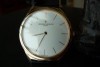
5. The case is a treat. At 37mm with somewhat extended lugs it wears really well on my 6 5/8 inch wrist -- I was a tiny bit concerned that it would look small, but in practice it seems just right:

For me the case makes good use of its rounded bezels, which give a classic look and feel. The caseband itself is slightly rounded as well, but just enough to give some interest (and to integrate with the lugs). On the wrist, the look is more linear than rounded. In addition, while the front crystal is slightly domed, both the front and rear crystals are set virtually flush with the surrounding bezels -- and on the back, this absence of any sort of surrounding ridges is both visually pleasing and helps the watch to sit flat on the wrist. For me the watch is neither too thick nor too thin for its diameter and overall styling.

I know that some people are not overly fond of the extended lugs, but they work for me and my wrist shape (my wrist isn't that big, but it's wide across the top and thin from top to bottom, if you know what I mean).
6. Did you notice the crown in the photo above? To me it's one of the nicest bits on the watch. Looks good, masculine without appearing out of character with the rest of the watch -- and most important, an integral part of the winding system that starts here and goes all the way through that great click and barrel wheel (more on that later). Easy to grip and provides a great tactile experience in conjunction with the winding feel.

Happily, my watch is WG, because the crowns on all of Dufour's white metal watches are WG (unless I'm mistaken). I have to admit that it would bug me to have a PT Simplicity with a WG crown -- I'm just obsessive enough that I'd spend all of my time staring at the crown in different lighting situations, trying to convice myself that I really didn't mind. On this watch, everything matches -- and having seen this WG watch and a PT example side by side, I can say that the difference in color between the two watches, while possible to see, isn't very big.

7. The movement! Seemed we'd never get here, right? Second key word for the day: Glow.

The appearance of this movement is like nothing else. Of all the watches I've seen, only Philippe's and Kari's can be said to have finishing that glows -- and the Dufour does so in a distinctive way. In some lights and from some angles all you see is bright silvery rhodium -- from other vantage points, the striping comes into play. The overall impression of visual brightness is like nothing else I've encountered.
In this one photo, we can see a huge variety of finishing techniques: sharp-edged striping (which of course aligns perfectly from bridge to bridge), beveling, bluing, black polishing of screws, bridges, and sinks, curved brushing on the name and number plates, perlage on the base plate, hand engraving, and some that I'm sure I am missing. On the vertical edges we can't see here, clean horizontal brushing. Yet when you look at it, everything seems to fit -- there are no "look at me" oddities that disrupt the harmony of the whole.
8. The screws are perfect -- even after a recent service, I can't tell that the heads were ever touched. The bluing is ultra-deep, and the polished screw heads are consistent and crisp.
9. The name and number plates are beautifully hand engraved, and fit with zero tolerance into the recesses in their bridges.

And, the plates themselves are hand engraved and then brushed in a curve with a radius consistent with their distances from the center of the case. Someone thought about this in advance, and we know who it was...
10. If you look at this and other photos, you will also notice that the colors of the "yellow" components all match. None of this "some wheels are brass colored and others are RG colored and the accent plates are a little different" stuff. Again, harmony and coherence.
11. Horns:

Philippe often says that when he was restoring old movements, he could tell who made them by looking at characteristic shapes of components and finishing techniques. His trademark touch is the inclusion of the types of horns shown above. Completely cosmetic (and likely a real challenge to finish) but absolutely characteristic. Oh -- while I was looking at this photo just now I noticed the radial brushing on the small bridge under the balance cock...
12. I love this one little bridge:

The curves are mesmerizing, and that black polished cap is to die for -- look both at the quality of the polishing and the absolute perfection of the match of the cap to the rest of the bridge, both in terns of the beveling and the zero gap between cap and bridge.
13. Symmetry and complementarity:
In the photo below, look at how the shapes of the bridges mirror each other, but not in a slavish way. At the left, they're parallel -- but down by the jewel the upper bridge sweeps in a curve (complementing the shape of the jewel) while the lower bridge cuts sharply into an internal angle (complementing its own jewel but not violating the overall relationship with the upper plate).

14. The bevels are all the same -- on this watch, the depth and radii of the rounded bevels are all identical, at least as far as I can tell. By contrast, on the Observatoire the radii vary from bridge to bridge -- although in fairness, Kari had to deal with the pre-existing design of the Peseux 260 movement while Philippe was starting fresh.
Only one small thing here: take a look at the upper inward curve of the bridge in the center below (beneath the screw to the right of N. 49). To my eye, the apex points to the left of where the outward peak across from it is aimed -- and the vertical finishing of the inner apex is not a perfectly clean knife edge as on the other inward curve lower on the bridge. I've seen lots of photos of this exact spot on other Simplicities, taken by SteveG, SJX, and others, and have always marveled at the perfect symmetry. To me this one is just short of that standard -- I'll leave it to others to conclude whether this is a) a delusion on my part; b) a minor issue; or c) evidence of the handwork needed to create a masterpiece like this one.

15. OK, after that brief digression, back to the "loves!" I hinted at it above, but there's a reason why the winding on the Simplicity is often talked about -- it's just great. My pal tahoeblue, the king of winder/pusher feel, declares it tops -- for me, it's at minimum co-equal with the winding on the Dato and quite possibly in a league by itself. And, as has been written about before, it's all part of a little show arranged for us by Mr. Dufour -- the old-style (and gorgeously black polished) click spring pops in and out as the accompanying wheel moves from perfectly finished tooth to tooth and we both watch through the case back and feel it through the knurled crown. Oh baby! I keep waiting for it to run down a bit so that I can wind it some more.

I think that SteveG's photo of the wheel above is the best I've ever seen, and I think his actual wheel might be a little nicer than mine as well -- my teeth look a little punier and the finishing angles on the tips of the teeth aren't as distinct. Isn't it great to be able to nit-pick things at a zillion X macro magnification? By the time you're worrying about this stuff, you have no worries...
16. Onward! There's a really cool spiral of jewels at the heart of the movement. Functional, I'm sure, but also quite attractive. I really like the use of the huge central jewel -- may or may not be needed technically, but it is the "right" size for the horned extension of the bridge.

17. Speaking of technical matters (in which, as is already painfully obvious, I am no expert) I do like the fact that this is an in-house designed and executed movement. Yes, I know that there is some controversy about whether the wheel spacings match an old LeCoultre design, and not every single piece of the movement is made in Le Solliat, but those things are of no consequence to me. I like the old-style 5 bpm frequency and the free-sprung movement. Again, all the things you would expect as part of an ultimate traditional timepiece. The movement doesn't hack, but that's all right as it keeps ticking right along as you change the time on the plane, and when you push the crown back in the minutes hand sits dead still rather than jumping one way or the other as it so annoyingly does on so many watches.
18. I should mention that it keeps great time! Over the first 25 days (worn every day) it has gained a grand total of 7 seconds. That's right on the pace of my Observatoire, which gained 9 seconds total over the first month. I think I'll declare a tie at this point. I should also mention that I've changed the indicated time several times by full hours as I've traveled from time zone to time zone -- always adjusting the hours forward. Each time, the effect on the seconds indication the next day has been zilch.
19. The movement fits into the case -- the rear crystal is filled with the movement, and there isn't much vertical wiggle room between the crystal and the movement, either. Some people say that the movement fits even better into the rear window of the 34mm case, but this looks great to me. Another less known thing is that Philippe actually custom sizes the movement to the individual case! The tolerances on the interior diameters of the cases are not to his satisfaction, so he actually measures the inside diameter of the case with a set of different-sized plugs and then turns the movement base plate so that it fits exactly into its designated case. I love the whole idea of zero-tolerance (or minimum-tolerance, which I suppose is more accurate) craftsmanship, executed here to good effect.
20. The strap, by Camille Fournet, is croc on both sides, and padded only as far down as the beginning of the holes on the 6 o'clock end, making it easier to fasten and flatter against the wrist.
I do like the croc inner, shown below. The strap is a bit stiff when new, but quickly forms to the wrist.

21. The clasp is clean, flat, and has a slot to hold and protect the tang. If you look closely you'll see that the slot narrows past the end of the tang -- it really holds the tang securely!

22. I won't repeat all of the box photos from earlier, but the box and papers are absolutely in keeping with the watch -- tasteful, restrained, and beautiful.
23. Finally, it is a Dufour! (had to slip that in -- to have met the man is to admire his work and want to share in it).
OK -- if you're still with me, you are a patient soul! I promise that the list of "not sures" will be shorter, and are mostly tiny things:
1. No anti-reflective coating on the crystals. With a white dialed watch this is less of an issue, but I've seen the grey dialed WG watch and it can be tough to see the time. In a similar vein, this is a watch (especially the movement side) that presents itself best in diffuse light -- in harsh restaurant lighting or daylight the bright reflections can be a bit much.
2. Can you say "scratch magnet?" Well, hairline magnet, at least. That wide convex bezel will certainly pick up some hairlines as we go. The good news is that the previous owner of my watch wore it quite carefully, and after a very light touch up from Philippe it came to me in as-new condition. My expectation is that this will be the same after future servicing, so I'm not too concerned about it.
3. The strap lengths are not right for me:

As you can see, the clasp isn't remotely close to the center of my wrist. Need the top side about 15-20mm longer, and the other side shorter accordingly! Obviously not a real big deal, but with the price of straps I don't want to end up having to buy a "long" and a "short" and using only half of each. I feel almost silly bringing it up -- "Gee, Gary, how is your new Simplicity?" "Oh, not so good -- the strap is the wrong length..."
4. OK -- here's the only substantive one. I know it's sacrilege, but I'm not sure about the striping on the movement. I know that it's the traditional style, I've seen Philippe demonstrate it with the ebony wheel, I love the way that in certain lights it looks like (as one Purist said) cake icing spread with a broad spatula, I admire the living daylights out of it. At the same time, I think I'm more a devotee of more pronounced striping (not to the level of the almost harsh stripes used by Lange, but somewhere in the KV range).
Otherwise (and perhaps even including the above), it's all a matter of personal taste. The word "Metalem" on the dial? Well, they did make it, after all. The lug shape? Good for me, not for others. Lacquer vs. enamel dial? Yeah, might be nice but I might actually wear the watch less. Flipped Arabics and unflipped Romans? I don't think Philippe is going to get into that discussion, nor should he.
The list of "don't loves" is: nil! This, for me, is really a great piece. Many people with better taste and superior technical knowledge have said all of that and more, but I hope that it's OK that I add my 2 cents to the pile.
Let's go all the way back to the top: how does this watch fit into the love/desire/admire scheme? Well, it's still early days -- as with many relationships that start well, I suspect that love will grow even more over time. As of today, though, I suppose I'm marrying the Observatoire, stepping out with the Antiqua, and setting up a shrine to the Simplicity. If I torture the analogy further, that might suggest that I am having a self-destructive long-distance relationship with the VA-1 (just kidding, Volker!) and flirting at the office with the One Hertz (and who knows where that might lead, Bart and Tim...). And when they all leave me, I'll just settle down with a nice German watch like my parents always told me to!
Hope you enjoyed at least a bit, and thanks for reading!
All the best,
Gary G
Simplicity wearing impressions (with new photos)
Well done Gary!
Thanks, Weekeat!
Gary, my favorite summary I have read of the Simplicity
Very pleased you enjoyed it!
An entertaining read Gary!
Don't strain your eyes too much!
All worth it Gary all worth it!
Lucky wrist


What a fantastic post Gary!
Thanks very much, Fernando

you own a pieceof watchmaking history. Thanks for the open view with not only likes
When the perfect watch is made
Wow, I really enjoyed that review, Gary!
It surprised me as well

a really, really great review!
Thank you so much for this splendid reply (photo examples included)

Cotes de Geneve
Thanks for the additional comments

Thanks, Don -- be on the lookout for my next post...

fantastic post
Means a lot to me coming from you, John

That was some comprehensive post. I often wonder...
It's an interesting question, Ronald

Where do you get the time to do these reports?
Extensive business travel away from home helps, I suppose!

Tremendous and thoroughly well written post Gary, thanks for taking the time!
As you have said yourself, Tim...

Fantastic writing, Gary!
As always, Ken, you are very kind
I really enjoy reading your reviews...
My pleasure, Dave

Thanks, Arthur!
Definitely Gary!

Sensing true love with this post...
Great to hear from you, Echi
Hahaha!
Highly entertaining and informative observations...
My pleasure, 'bear

What mor to add?
Would love to hear your points of disagreement!

Spec of dust or dot?
End of the Roman Numeral V
Thanks, Ling

I don't like it
I don't like it either,Gary!

You are doing a Britney Spear..."ops I did it again" plus becoming a "judge" !! :)-
I need one of these too lol
Enjoy your Observatoire for now!

Interesting thoughts on a beautiful piece
Thanks, SJX!
One additional photo
5078

You are obviously in love with this my friend!
Attention to detail!

Gary, thank you for such a marvellous read.......
Glad you enjoyed it, Tony
Stephen, you hijacked the thread! Kidding...
Actually rants like yours shows how pitiful i am

(sigh)
An interesting dialogue
keep'm coming!
Dear S...
non-watch related observation......
Sorry for being this late
Thanks for weighing in, Thomas!

Great post...
Thank you, Hans
Thanks to all ...
Thanks for checking in!

Well, Gary, your post has just placed the Simplicity...